Tuesday, 1 February 2011

Case Study - Spiderman 3

Spiderman 3 was made by Sony Pictures and had its premiere in the Japanese capital - the first Hollywood blockbuster to do so. Spiderman 3 has made the most money on this side of the world than anywhere else.

Spiderman 3 is a good example of synergy because it released promotional material on several different platforms including, trailer, magazine and film posters etc.

Spiderman 3 is a action/drama fantasy which is highly likely to attract the male sex, also children will be fascinated by the artificial image on the front cover of the film and advertisments. Spiderman 3 also has scenes which include romance which is likely to attract the female sex as they like to relate to such situations or even escape from their own problems, women and girls tend to be more emotional than males which is why this is likely to attract females. Violence is also portrayed in this action drama which automatically brings attention to the male audience. Although the film has scenes which aim at both genders, I personally believe it is aimed at a higher proportion of males than females due to the image on the front cover and the genre it is.

Poster

The poster of spiderman 3 on the left connotes two sides to spidermans personality the bright side of him and the other represents the dark side of his personality which is the black suit. There is also a mirror between the two personalities.

The colours used on this poster and the font used are fixed throughout all releases of this film and throughout all types of releases such as magazines and trailers etc. The actual colours used on the building are very similar to the pattern on spidermans suit, and the high angle shot can leave the audience feeling very edgy however the colours used for the sky portray a very calm feeling.

Spiderman 3 follows the action drama which shows how a character has two personalities and these are built up throughout the film.


Magazine


The main image on the cover dennotes Tony Maguire the main character. This image connotes the use of the star to promote the film shown in a black suit which relates to the film as spiderman has two personalities and the one shown is his dark side. This shows a heavily promoted character in a black suit, this is a gimic or promotional aspect which helps advertise the film. The characters face expressions and body language shows how he has power over other people, this is because he has dark sinister evil looks upon his face and his one arm positioned in front of he other. The magazine also has puffs to help promote the film and sell the magazine, this one has a bold white heading saying 'free' this is likely to draw people's attention to other blockbuster films especially if they like spiderman as the puff on this magazine is advertising rocky. Sub titles such as the new look helps promote the film also as people may want to see the difference and how his character could have changed.


Trailer - At the beginning of the trailer there is a establishing shot of many buildings, this is good as it shows where the film is set or a location that is used in the film. A fade to black is then used as a cut this is used to build up suspense as spiderman them comes into the trailer but you cannot see him, you know that it is likely to be spiderman as a high shot is used whilst moving along and is thought that spiderman is flying. Again a fade to black is used and this again builds up the idea that spiderman is flying as there is a lot of suspence and a shot is then used where there is a crowd looking high in the sky, which makes the audience ask themselves what are they looking at? Spiderman is then introduced to the trailer flying in the air and the pace is very quick. A low angle shot is used when spiderman is over head, this shows that he has a lot of power and influence over the people around him. The cuts used to separate each shot get quicker throughout the trailer to build up excitment for the audience, also the background sound which is off screen leaves the audience in more suspence.


http://www.youtube.com/watch?v=PCmMLfXdURs

Sunday, 23 January 2011

Trailer Research: High School Musical 3

Micro
All high school musical films 1-3 belong to the collection of disney. This is likely to be due to Disney being related to childrens films and High Scgool Musical is targeted at children. Disney use various elements to attract childrens attention such as bright colours, and a lot of the time animated characters. High School Musical however is normal characters but are very cheerful which appeals to children significantly.

The sound at the beginning of the clip blends in before a picture appears on the screen as it does with the Dark Knight trailer too. There a a number of fades in the trailer and start of very slow then they speed up to build up excitment, the pace is very quick at this point and many different clips are shown (a montage of shots) the atmosphere portrayed is very happy and likely to encourage the audience to go and watch the film or buy it on DVD. Once the male character Zac Effron is introduced in the trailer a fast cut to a black background is shown, this leaves the characters in suspence as nothing negative is occuring.

The stage where the two male characters are in the basketball stadium is the stage where the pace increases massively and a sense of excitment is released.

This shot also establishes a shot revearse shot between the two male characters. Although the trailer is very dull the lighting is in between low key and high key however as it carries on it forms to high key. This translates the emotion from a fairly miserable feeling to a happy, energetic emotion.

The are a number of soundtracks played through the trailer of High School Musical 3, these tracks are from the film itself and the first track is a faster and more up beat sound to build up excitment for the audience and the second track portrays females emotions as the track is a lot more slower. As it is a musical film this trailer will attract a significant amount of music fans as it evolves around music throughout.

Macro

The main setting within the whole film is in the high school, and many locations are evolved around this area, e.g the basketball stadium or the gym. Various locations play a part in how the male character Troy develops throughout the film. Troy played by Zac Effron is a huge success since the first high school musical film and has become very appealing to the female eye. Many tweens and older teenagers look up to Zac Effron as a positive role model.
It is aimed at a tween audience as it is filmsed in a school and has many young characters and a cheery atmosphere they a number of young children look for.
The number of songs revealed throughout the film gives the genre of a musical as many songs are played and sung throughout.
With high school musical being a huge success, like many other disney film it has merchandised over a number of products such as the release of a soundtrack and featured on many childrens products such as t-shirts, bedsheets etc.
The hook of this film would be all ther singing, dancing and laughing as it is a very active impression and is likely to encourage the audience to get involved and singalong and dance. The colour scheme is also likely to attract the audience, particularly children as they are bright primary colours which attract children alot more.
Not only is the film a musical but it also portrays a teenage romance which is the reason it appeals to a number of teenagers and tweens as they are in these stages where they can relate to the film themselves.

Thursday, 20 January 2011

Trailer Research: Dark Knight


Micro At the beginning of the trailer there is a shot of the makers of the film, the 'warner bros' followed by the 'legendary pictures'. Both in dark black and grey colours, the colour scheme has been changed deliberately to portray a dark and eery message. The audience will suspect from this that the film could either be a action film or horror. The film is likely to attract a significant number of males due to the colour scheme used.


Once these sign appear a fade to black is used and instantly gives off a dark, spooky theme. The audience is likely to straight away be attracted to the film knowing the film maker company as 'Warner Bros' is a very successful and produced many successful films. The trailer then straight aways has a voiceover on the fade to black clip, the voiceover is a male voice, very deep and comes across very negatively. The voiceover is off screen sound (the characters cannot hear it). The voiceover explains the basis of the storyline so that the audience has a rough idea and encourages them to watch the film.

In the film trailer dark knight there are 69 cuts used. They start off slowly then as the trailer carries on the speed increases. A lot of fast cuts are used and this quickens up the pace of the film.


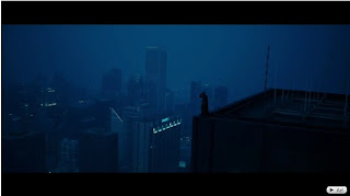
There are a lot of panning shots used in the trailer to Dark Knight. This establishes the setting and the characters within the area's. This gives the audience a sense of where the film is set and what type of city is used.

A faster pace is built up again by quick cuts of different locations.

A fade to black is used again after the panning shot shown on the right, this again relates to the title dark knight, being very dull and gloomy.

The second shot portrys a over head panning shot.


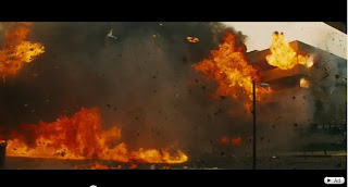
The shot on the left portrays high key lighting image as it is quite bright, due to the burning fire, however through the trailer many shots are low key and this builds up a lot of tention and the audience feeling edgy.

The shot of the explosion above is also a hook in the trailer as this will attract the audience a lot more to go further and watch the fil or buy it on dvd.


Macro The hook of the trailer is very intrieving as you want to know what happens between the joker and batman. Even though the themes are very bulging throughout the trailer, the parts where the joker is shown adds comedy to the film and this is also shown through the make-up used and his costume. Although the joker plays a important role throughout the film his costume does not portray a important character that appeals to the audience as paying much interest in taking him seriously.


The shot above also reveals the hook of the trailer that will appeal to a number of males as explosions are seen as fascination and they are likely to appeal to males more than females. A lot of questions are asked which will encourage the audience to go and watch the film or buy it on DVD as they will want the answers to be revealed, These questions are also a hook in the trailer and will leave the audience in suspence.

Friday, 14 January 2011

Research into Existing Posters

The film poster to high school musical is a very simplistic design compared to the other chosen poster 'The Uninvited'. The target audience high school musical tends to portray is children and a proportion of teenagers (tweens). I think this because the colours used, the age range of the characters also the title 'high school musical' aims towards a younger audience.

The dennotations on this poster are the bright primary colours and the characters positioned in front of the red curtain. Also the large main title and the capital letters used.

The connotations the front cover portrays to the audience is a film revolved around music, aimed mainly toards children, this is because the title includes the phrase 'musical' and also 'high school' which signifies the target audience as there are also children on the front cover, very happy and full of energy.


The colour scheme is bright and colourful primary colours used to attract a significant number of the younger audience. Bright colours tend to attract the younger children more because they portray a happy time and these colours are also likely to be what they have been associated with whilst growing up, with toys and the environment of the school etc.

As High School Musical is based on a musical storyline with romance between two of the characters, this is highly likely to attract young teenagers as they can relate to the storyline and sometimes escape from their own problems.

The film also stars relatively young actors who are not well known in terms of other films and television programmes, this means the audience is more likely to relate to them as they havent got a history from previous roles. However Zac Effron became a very popular male in the eyes of teenagers, once the film was released.


The two pictures above show an image of the main female character, this shows a glamourous girl that young girls tend to look up to as positive role models as they have a lot of characteristics.

Although there is an image of both sexes on the cover, (males and females), I strongly believe the film is more so targeted tpwards females as the storyline appeals to them more.


The video above shows a clip of the films of a musical scene. This shows how the filml is aimed towards young children as the musical is very catchy and has a lot of energy.

Thursday, 13 January 2011

Research into existing Posters

The reason I have chosen the film poster in the horror genre is because the promotional package I will be producing will also be within this genre. The reason the horror genre was interesting take action upon was because it is a easy identifiable genre which the audience can relate to by the icanograpghy characters and themes used in the clip. The first film poster I have chosen to research is called 'The Uninvited'. The film poster to The Uninvited conveys an image to the audience that reveals the genre of the film which is horror. This is because the colours used are low key and dull, the colours they used are shades of black and white/grey which portray a negative image. Another reason the film comes across as a horror is because the only character on the cover seems isolated as he/she is seen as very dull and blacked out, this connotes a negative portrayal of the character and before knowing who he/she is they are labelled as the antagonist. The character is outside of the window on the cover which strongly relates to the title 'The Uninvited'. Although the audience is likely to know the genre of the film I believe they will feel in suspense to what will happen in the film. The fogged out picture of the outside view of trees adds a Gothic effect to the image as you do not know what is behind her or if anything is watching her. The whole image on the front cover of the poster reveals the story to The Uninvited as the character is stood outside the window, this signifies he/she is not welcome. With the colours being dull it could put the audience of the film as dull comes across as boring however in this situation the image makes it seem a whole lot more exciting, the image itself could help promote the film. As I have not seen the film it seems as though the character on the front is the main part, also due to the shade of the character I believe he/she is the antagonist however if the character is not the antagonist I believe he/she is the main target.

The back lighting on the cover gives a image of shadow which gives a creepy, mysterious, intriguing, sinister effect. The uneven aspects of the writing connotates a unsettling storyline. The title of the film gives ancourage as it is portrayed the the character on the front is the uninvited.

Friday, 9 July 2010

Research Into Existing Magazines

The second magazine cover I have chosen to research into is called People, the film that this magazine illustrates will be New Moon.


The target audience for New Moon would be aimed towards girls. This is becuase it is based on a love story between a man and women. Although a male actor has a major role in New Moon it is usually teenage girls and women who pay most attention to romance. Also young girls and women are usually attracted to the opposite sex and the image of the male actress attracts a large scale of females. With New Moon being a romantic fantacy it enables women mainly to relate largely to the storyline as they are portrayed as more emotional and romantic than the majority of men. On the front cover of People, the male character Robert Pattinson, is stood a step in front of the female character, this shows how males tend to have more power over women, and how women are seen to come across as innocent. The denotation of the magazine would be the sub titles, and different colours making headline stand out on the page, the conotations however would be the two characters as they are the main story to the magazine as it represents the film new moon. This connotation would be the key reason to why the audience is most likely to buy the magazine. The smaller images at the bottom of the page represents differents aspects of the love triangle in New Moon of the three main protagonists. This also encourages fans and others in the audiences to buy into reading about the film before watching it as the first film twilight was hugely successful.

Other key factors on the front cover of the magazine is the 'puff' this helps further promote New Moon. Next to the title 'People' there is a strap line saying 'special collectors edition' this helps promote the film and the majority of fans are likely to want to read up about the up coming release of the film.

Wednesday, 7 July 2010

Research Into Existing Magazines

The first magazine cover I have chosen to look into is called Total film, advertising the film Max Payne. The target audience of this film would be older teenage males and men, I think this because I believe they may be attracted to the image of the star character Mark Wahlerg as he is holding two guns and this connotes him to having confidence, being brave and having power. Males are usually attracted to images of males characterised in films due to them being able to relate to them, whereas girls are related to chick flick films for the same reason. The cover of the magazine is dull, the time of day is night time and the character is dressed in black clothes, this shows a negative effect on the behaviour being displayed. The denotation displayed on the front of the magazine cover would be the sub titles, these titles catch the audiences eye, and give a reason for them to buy the magazine. The conotation of the magazine however would be the main character Mark Wahlerg, this is because he is the main story for the magazine issue, and is one way of advertising the film Max Payne along with the enlarge title in white. There are many conventions used on the front of the cover such as, the bolder black image of the two guns, with one being placed in front of the other to show aggressiveness from the male holding the gun, also the headlines and darkness of the cover overall.


The image on the left shows how the two guns dominate the main image of the male actor, this is shown by the guns being pointed towards the eye of the camera and held high and in front of the character. With the guns being placed high and in front this suggests how much power the main character has. This is a symbol of masculinity, (his man hood). Many teenage males would be fasinated by the image on the front cover of this magazine and are likely to be comfortable to see this film.


This film would have been released on a positive note, knowing a large scale of male teenage boys will pay alot of interest in buying magazines, going to the cinemas to watch it and also talk about it with their friends, and encourage others to watch the film themselves. This will then make the film more successful.